
5 step framework for staying organized
Published:
As I learn to navigate R and coding best practices, I realized a crucial first step is getting organized. Staying organized is another challenge in and of itself, but it is much easier to do if you have a solid plan for your code before you get started. Thankfully, there are tons of ways to make sure you start on the right track and stay organized along your coding journey. I want to share how I approach the basics data analysis in five steps:
- Import
- Clean
- Wrangle
- Summarize
- Plot and test
This is by no means comprehensive, but I hope to provide a generalizable framework that makes the process of data analysis more approachable! This post assumes you are familiar with R Studio, but I will my best to include information and resources that are helpful for beginners.
Tips and tricks:
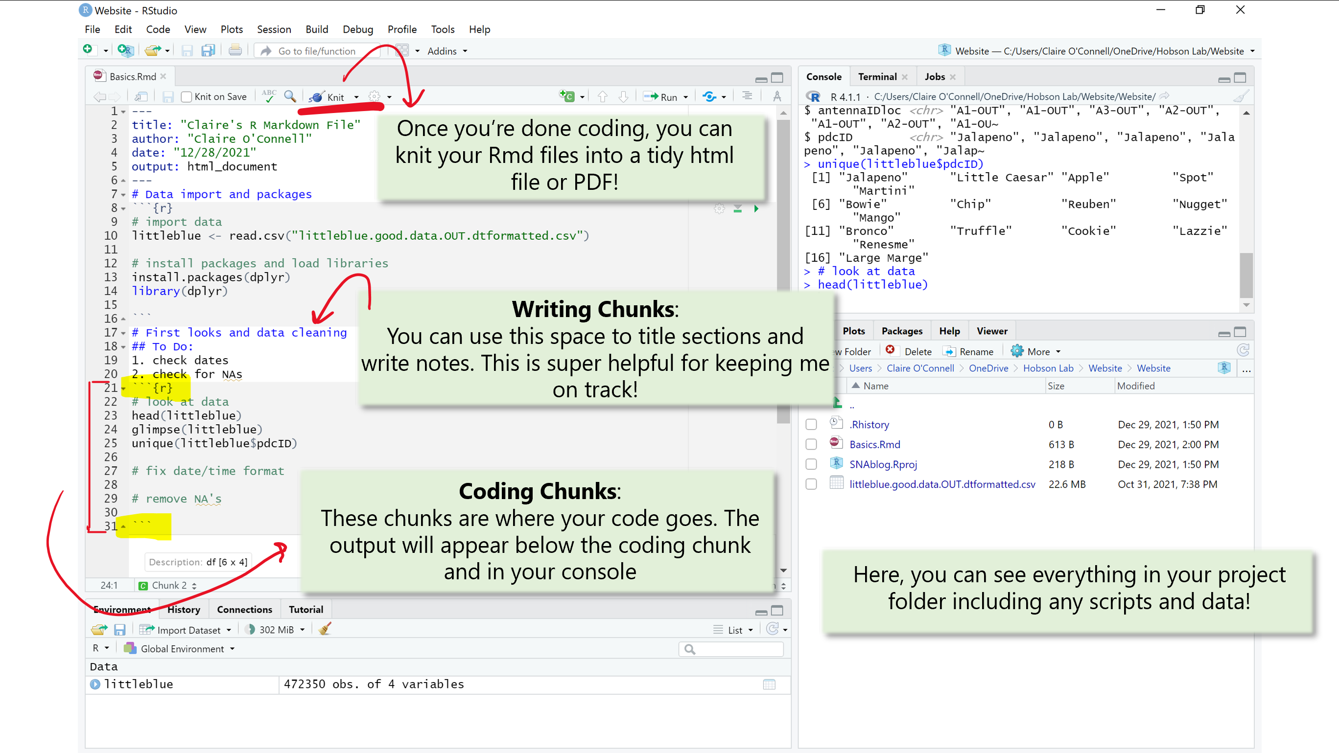
R Markdown files are a really great way to stay organized while coding. I prefer RMD files (compared to R scripts) because to you can combine text with code for easy annotations and notes and break down coding chucks to keep you on track and goal-oriented. You can find more information here. R projects are useful for keeping track and organizing related files. You can create projects that contain different associated scripts. You can also add your .csv files to your project folder. This way you have all data and associated code in one convenient location.
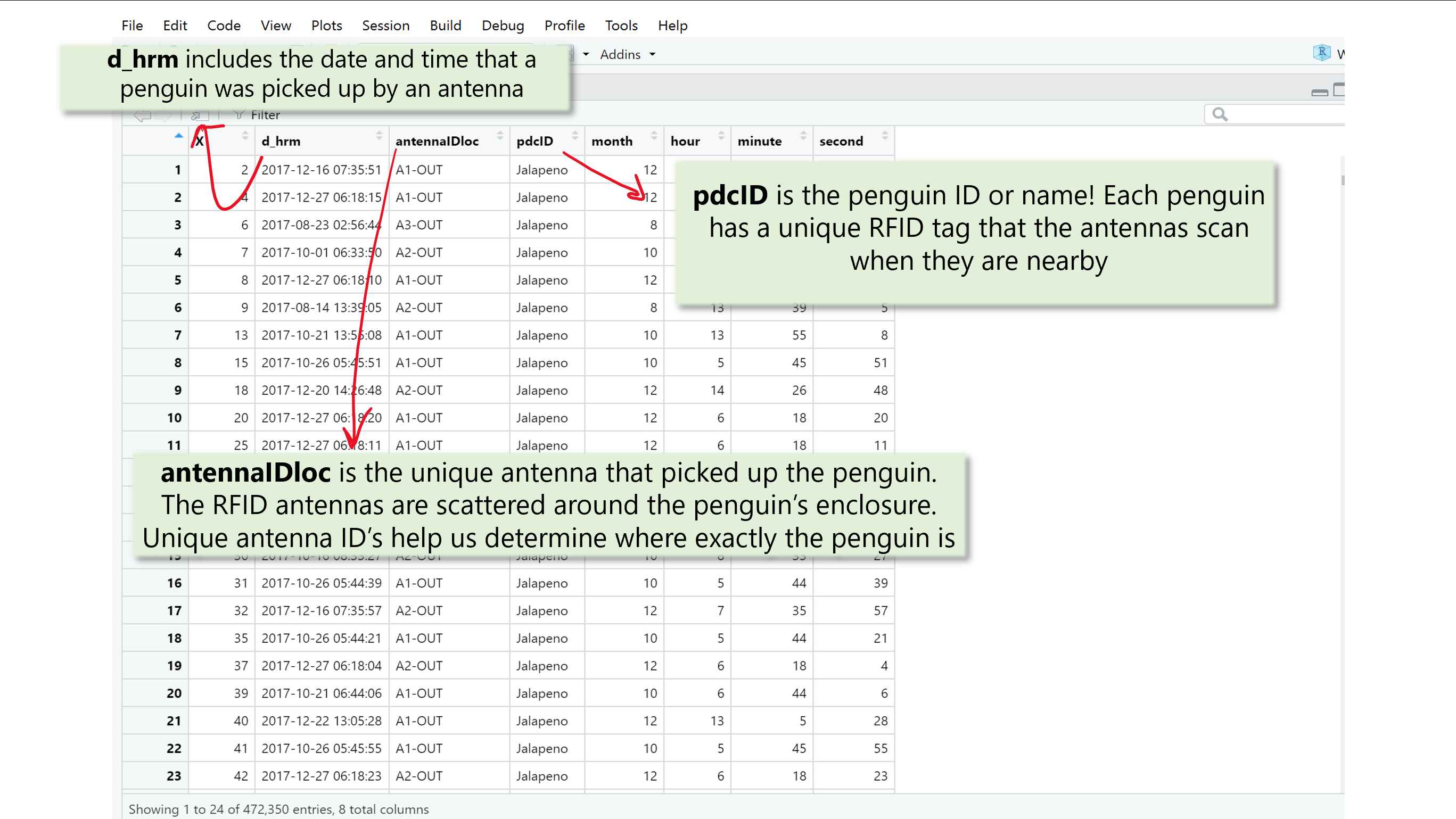
For this example I am using data collected from a colony of little blue penguins at the Cincinnati Zoo! The Zoo has RFID antennas scattered around the little blue habitat to collect automated data on the location of each penguin. My advisor, Dr. Liz Hobson, has been collaborating with the Cincinnati Zoo to help answer questions about penguin sociality! You can read more about it here.
Now that I have data on which little blue penguin was where and when, I can use it to figure out where the penguins spends most of their time (i.e. where they were pinged the most) in the month of December! I will walk you through how I might do this following my five step framework.
Import data
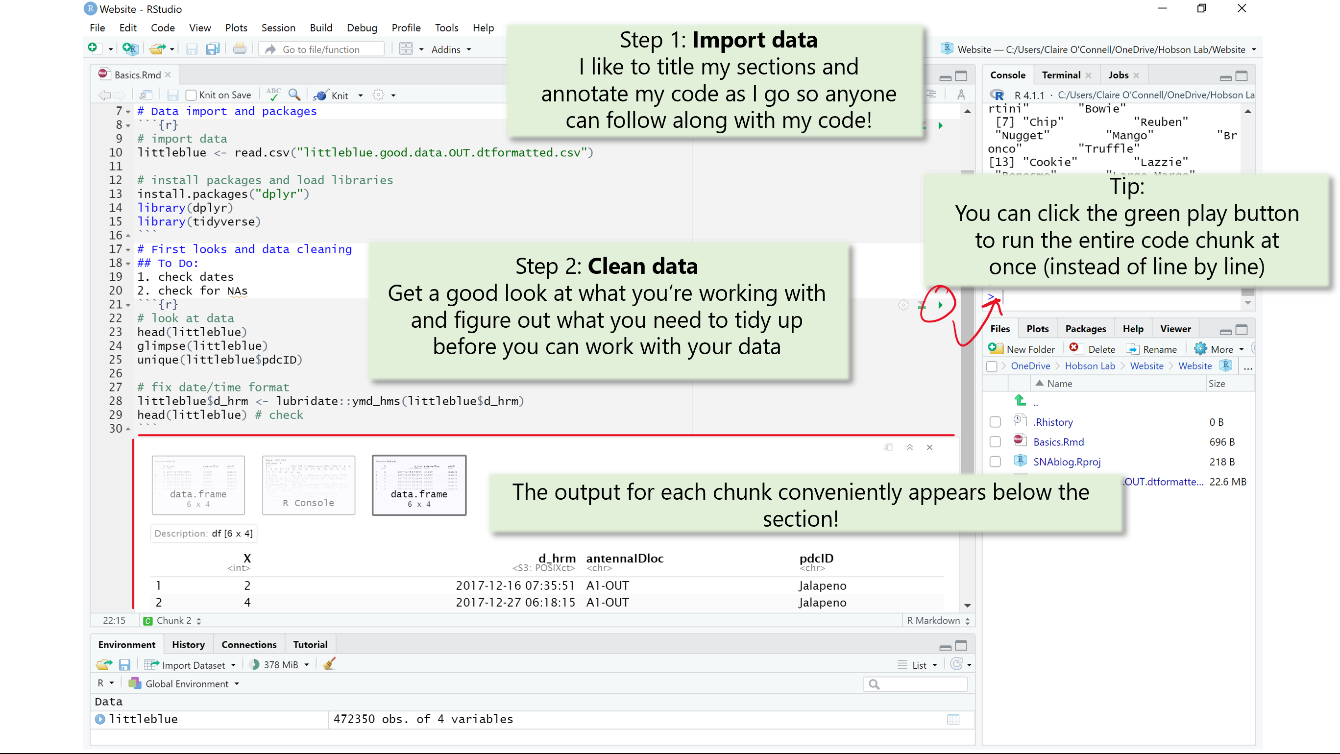
First things first: import your data! Once you import your data, you can find it in your environment and start working with it. Like with most things in R, there are many ways to do this. However, for reproucability and collaborative purposes, it is best practices to make sure your code runs efficiently. This is also a good time to install packages and load your library.
Here I import my little blue data and load the libraries I will need.
Helpful functions
read.csv() read_csv() install.packages() library()
read.csv() and read_csv() are very similar but not quite the same! You can read more about the difference here.
First looks and cleaning
Once your data is imported, make sure you get a good look at your raw data and figure out what you need to do to tidy it up. Here, you want to make sure the data were imported in the right format and check for data entry errors like typos.
Helpful functions unique() glimpse() head() nrow()
Tips and tricks:
Dates and times are notoriously tricky to work with in R, don’t get disouraged! I like to use the lubridate package from the tidyverse to help me out!
From a data ethics standpoint, it is important to make sure you aren’t misrepresting the data by changing any of its inherent properties. During cleaning, the point is to get your data in a workable format for future analyses (i.e. getting rid of NA’s).
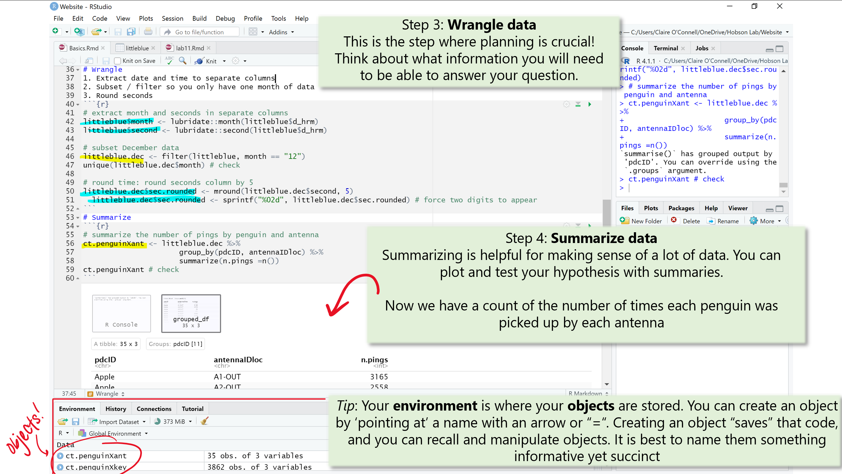
Wrangling
Now that your data is nice and clean, its ready to get ready to work with! Here, we need to make sure we have all of the information we need to test our hypothesis and/or plot. Don’t under estimate this step! Plannning is key and your future self will thank you if you annotate your code (i.e. write notes for yourself and others about what you are 1. trying to accomplish, and 2. line by line instructions).
Here, I extract the month and seconds from the date/time column (d_hrm) and create new columns (months and seconds, respectively). I then used my new month column to filter my dataframe to only include data from the month of December (12). I also created a new column called sec.rounded which is the seconds column rounded to the nearest 5. We will not need this for our goal of summmarizing where the penguins spend most of their time. It is just another example of what you might want to accomplish during the wrangling stage.
Helpful functions gather() sample() slice() mutate()
Tips and tricks:
This is the best time to have a plan! Write yourself a To Do list or write pseudocode to be your guide. This keeps you organized and on track. When in doubt, just Google it! Odds are someone has run into the same error you have and graciously posted the solution. Websites like Stack Overflow are very helpful!
Summarizing
At long last, you’re ready to summarize your data in a digestable and meaningful format. Here is where you get to make sense of your data by condensing the information we need to know to answer our question.
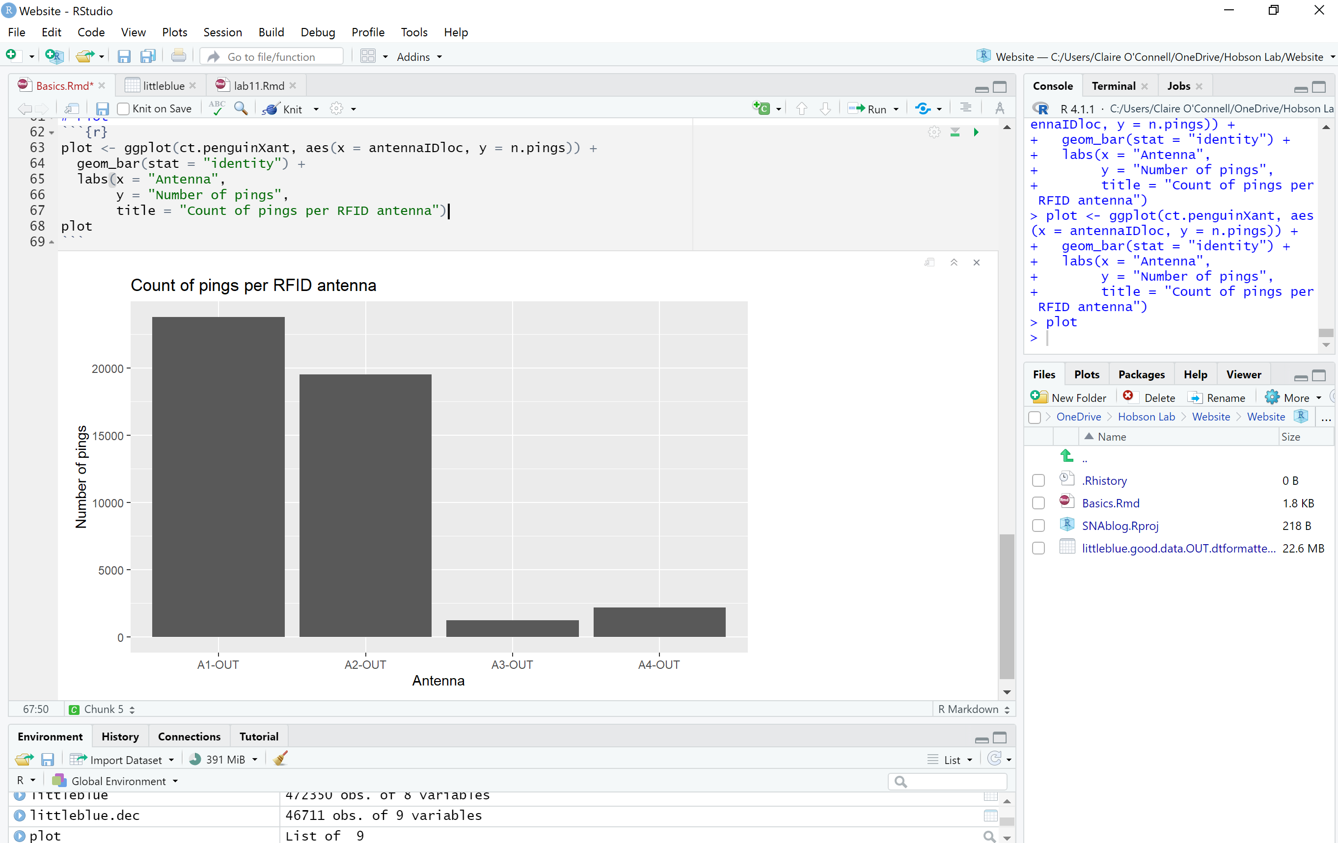
In order to figure out where each penguin was picked up the most, we need a count of how many times the penguins (collectively) were picked up at each antenna.
Helpful functions filter(), select(), subset()
group_by(), unique()
summarize(), mean(), n()
Tips and tricks:
At this stage, it’s easiest to have a plan for how you want to best visually represent your data. This means deciding what type of graph you are going to use and what data do you need to make the graph. With a plan, it is much easier to understand how you need to summarize your data.
Plotting and hypothesis testing
Now for the best part! For simplicity’s sake, we will just plot or data. You can use base R to plot, but I think ggplot is a simple and aesthetically pleasing way to plot!
We’re done! I hope this post can offer some perspective of how data representation and analyses works.